Chatsac Nexus | UI Design kit
Designed and developed the product language for a platform focused on conversational operations, CRM, and applied intelligence — transforming broad wireframes into a functional beta with a distinctive identity, clear hierarchy, and a scalable foundation.
My role: UI Design, Design System, experience structure, and critical interface review.
Context
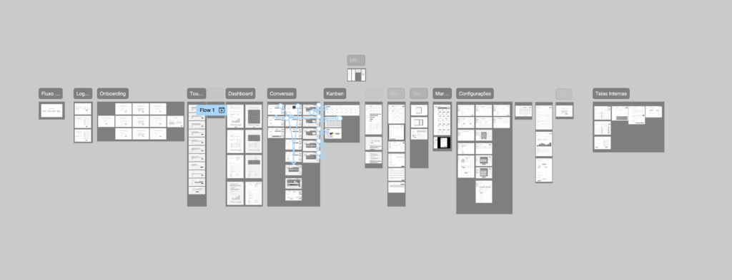
ChatSAC Nexus was created as a proprietary product designed to centralize customer support, commercial operations, and conversational intelligence within a single platform. When I joined the project, there was already an extensive set of wireframes mapping flows and features across different areas of the system.
This structure included modules such as Conversations, Dashboard, Financial Funnel, Conversion Engine, Kanban, Softphone, Campaigns, Audit Log, Settings, Onboarding, Marketplace, and support flows. The challenge, therefore, was not just to design new screens, but to transform this ecosystem into a cohesive, readable, and scalable experience.
My focus was to visually organize the product, define a consistent interface language, and establish hierarchy principles that would allow users to navigate complex modules without feeling overwhelmed by noise or fragmentation.
First signs
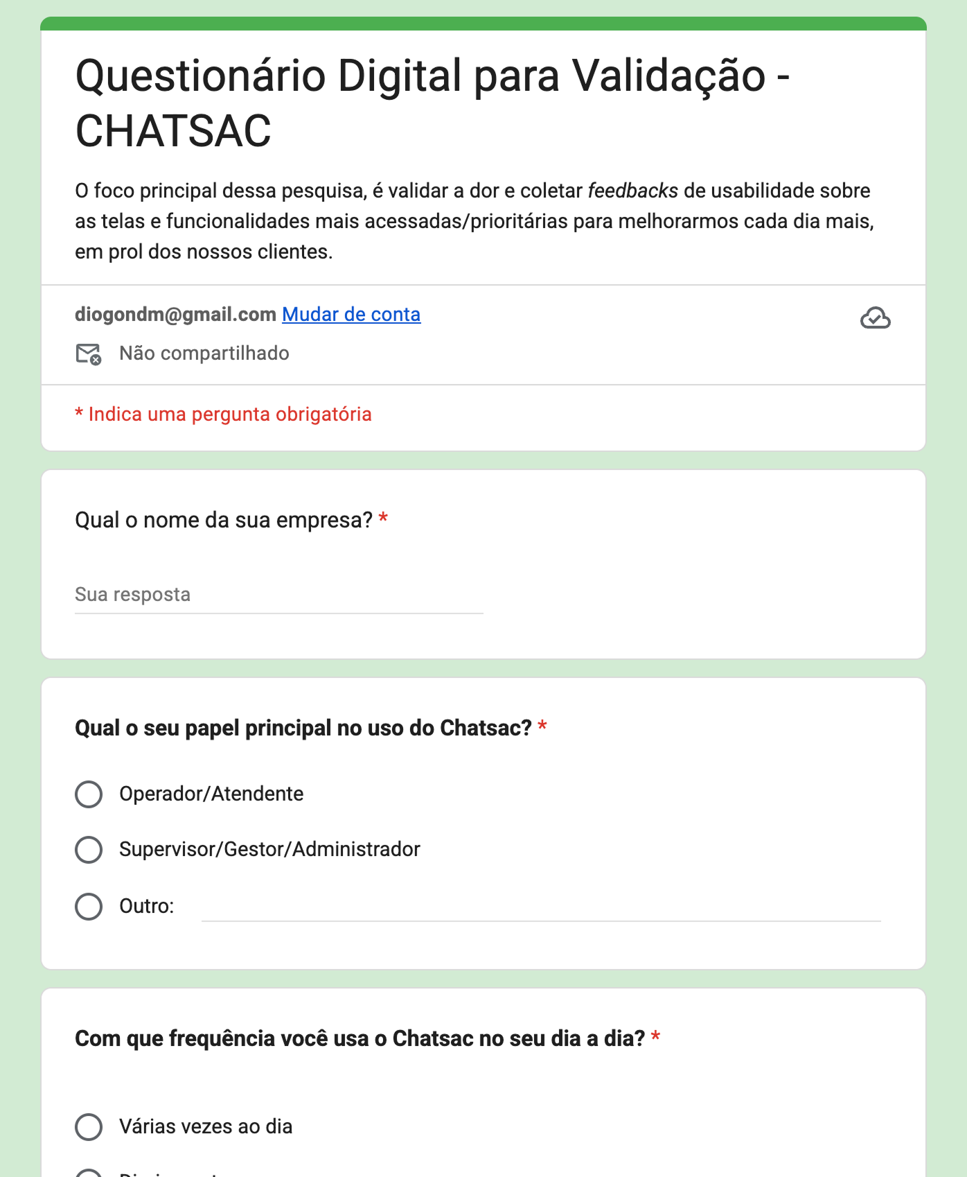
Before consolidating the interface, we conducted an exploratory assessment to identify users’ main pain points and the most critical areas of the experience. The questionnaire focused on qualitative signals: chat list speed, filter efficiency in the queue, loss of context between interactions, and the reliability of dashboards and reports. We also evaluated the relevance of features such as native CRM/Kanban and API integrations.
Because the sample size was limited, I treated the data as a product compass rather than statistical validation. I cross-referenced these signals with the wireframes and the team’s priorities to guide design decisions. Three patterns became clear:
- Operational Centrality:
Usage is recurrent and intensive throughout the workday. This makes speed, real-time updates, and information legibility non-negotiable requirements.
- Queue Intelligence:
Support organization requires more robust filters — such as waiting time, source, tags, and status — to prevent bottlenecks.
- Context Preservation:
When switching between conversations, users lost their rhythm. We identified the need to reinforce history and use visual cues that support a quick return to the conversation.
At the management layer, it became clear that KPIs needed to be more actionable and convey greater confidence. The product should not only display numbers, but connect operations and growth through CRM tools and data export capabilities.
Based on this, I focused the interface around three pillars: operational prioritization, Context preservation and managerial clarity..
The challenge
The main challenge of the project was to transform an extensive wireframe foundation into a product with visual coherence and a clear usage logic. Since the system brought together modules of different natures — daily operations, commercial tracking, data intelligence, automation, onboarding, and governance — the experience could easily become fragmented.
The interface needed to serve different needs within the same platform. For the support agent, the focus was speed, context, and action. For management, the focus was performance reading, bottlenecks, and opportunities. For the operation as a whole, the product needed to function as a single layer connecting support, CRM, campaigns, and applied intelligence.
My challenge was to find a language capable of balancing density and clarity, creating consistency across very different modules, and establishing a visual foundation that could support growth without losing legibility.
Design Process
To organize the experience, I divided the platform into layers of use: daily operations, managerial reading, and growth.
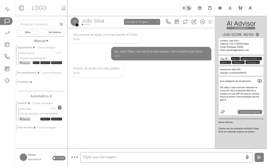
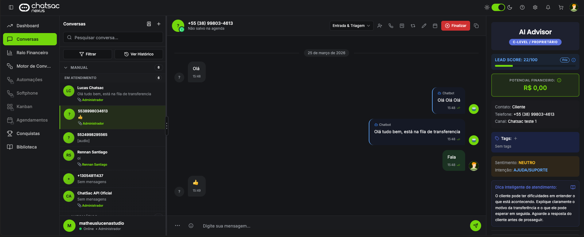
The Conversations screen concentrated the product’s operational core: queue, real-time support, quick actions, and contextual AI assistance. This division helped define the weight of each piece of information and prevented everything from competing for the user’s attention.
1. Organizing the product
In dense screens, the main challenge was to make clear what required immediate attention, what functioned as support, and what should remain in the background.
On the Conversations screen, the conversation itself needed to remain the main focus. The AI Advisor was introduced as a support layer: useful for interpreting the lead, suggesting actions, and bringing context, but without competing with the support flow.
2. Defining hierarchy
In dense screens, the main challenge was to make clear what required immediate attention, what functioned as support, and what should remain in the background.
On the Conversations screen, the queue and history help users understand the context, while the active conversation remains at the center of the experience. The main actions are placed close to the support flow, reducing dispersion and making decision-making easier.
3. Building the system
With the product structure defined, I built a design system to turn loose visual decisions into reusable patterns. The foundation organized typography, colors, spacing, components, and interface states to ensure consistency across different product modules.
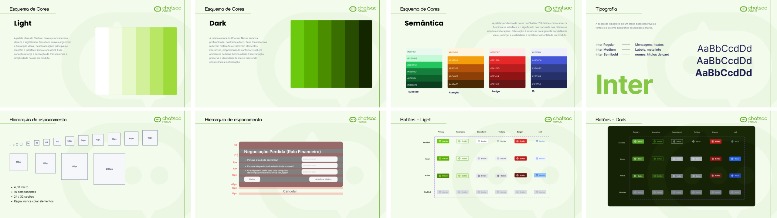
4. Applying it to the product
The design system was applied to the beta product together with the product and development team.
The guidelines served as a foundation for building screens in Lovable, guiding interface decisions, and making fine adjustments during implementation. This helped the product move from a wireframe structure into a more cohesive, visually consistent experience ready to evolve.
Beta Product Solution
As the project progressed, the interface began to take shape in the beta product, consolidating the structural, hierarchy, and visual language decisions adopted throughout the process.
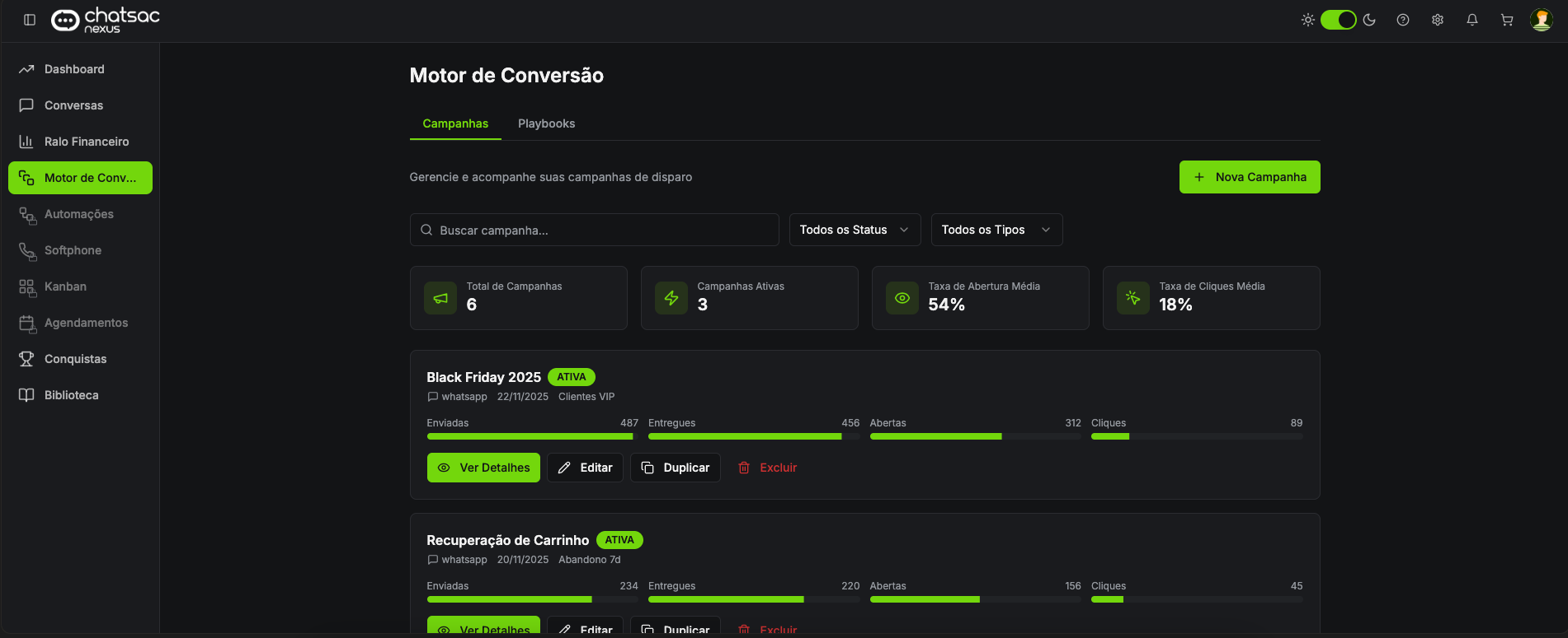
The persistent side navigation began organizing access to the platform’s main modules, while dark mode reinforced identity, contrast, and operational focus. On the Conversations screen, the structure between list, history, and support panel became clearer, allowing users to view queue, context, and additional intelligence without losing focus on the main support interaction. The AI Advisor began functioning as an interpretive layer, bringing together signals such as lead score, financial potential, intent, sentiment, and contextual recommendations.
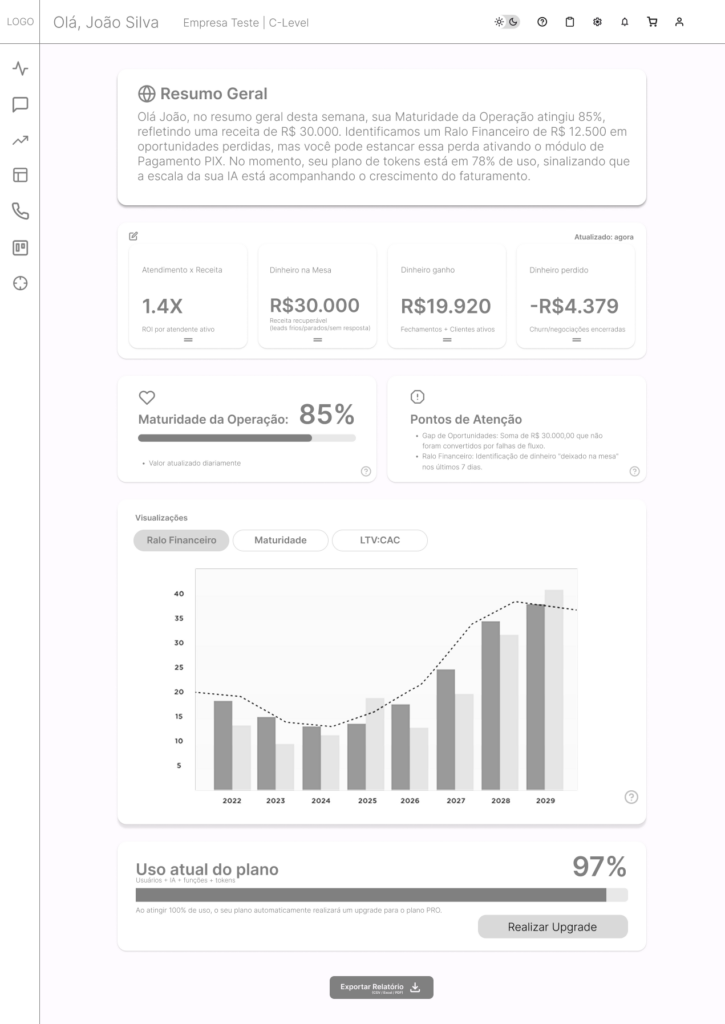
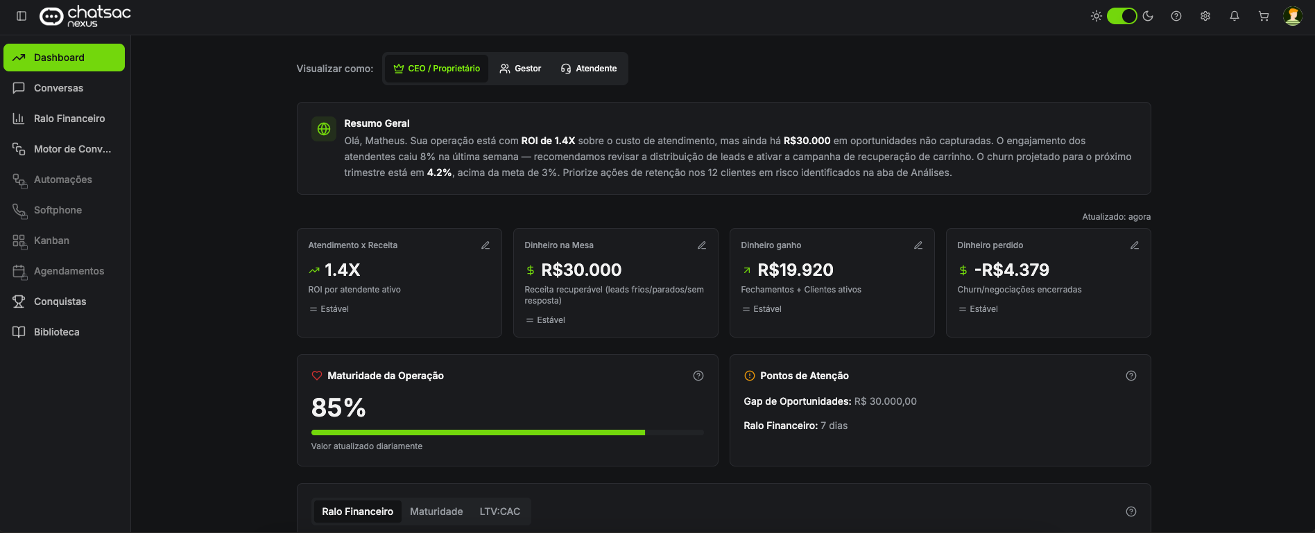
In the Dashboard, the reading experience moved beyond quantitative data and began incorporating an executive summary in natural language, connecting KPIs with diagnosis and suggested action. This helps transform data into interpretation, especially for more strategic profiles such as leadership and management.
In the Conversion Engine, the campaign list and its indicators became more direct, with status, key metrics, and operational actions made more visible. The Achievements area showed how gamification elements could exist within the platform without breaking system consistency, reinforcing engagement without compromising the B2B product language.
The result of this stage was the transition from a broad set of ideas and wireframes into a product with its own visual identity, consistency across modules, and concrete foundations for technical and functional evolution.
Results and Impact
The project helped transform an extensive wireframe architecture into a more mature, consistent experience ready for continuous evolution. Instead of a set of isolated screens, ChatSAC Nexus gained a unified product language, with clearer criteria for navigation, hierarchy, and action.
The main gains were qualitative, but important. The experience became more coherent across modules. Critical information became faster to read. Areas focused on daily operations gained more focus and predictability. Management modules began communicating their data more clearly. And the product gained a much safer visual foundation for incorporating new features without losing consistency.
More than designing screens, this work helped structure how the product should behave visually as it grows.
- visual unification across operational, managerial, and strategic modules
- visual unification across operational, managerial, and strategic modules
- a more consistent foundation for the evolution of the beta product
- greater clarity between support, CRM, intelligence, and automation
Learnings
This project reinforced for me that, in complex products, structural consistency is more valuable than any isolated visual solution. When the ecosystem has many modules, many user roles, and a high density of information, the interface needs to function as a system before it functions as a graphic piece.
It also became clear that a small research sample can still be useful, as long as it is treated honestly. Even without enough volume for statistical conclusions, the initial signals helped direct priorities and served as criteria for important design decisions.
Another important learning was realizing that wireframes solve scope, but they do not solve language. The transition from wireframe to product requires decisions around hierarchy, semantics, repetition, contrast, and behavior that only truly appear when the interface begins to gain consistency as a system.
In the end, ChatSAC Nexus was a strong exercise in transforming structure into product, complexity into clarity, and multiple functional fronts into a more unified and scalable experience.
The greatest outcome of this project was not just designing the interface of a module, but helping shape an entire product — with logic, identity, and real room to grow.