Partiu | Product Design
Partiu is a mobile app created to help residents of the Recife Metropolitan Area discover events aligned with their interests, budget, and social context. The project came from the insight that event information is often scattered across different channels, making it harder to discover relevant activities at the right moment.
It was developed as a UX/UI Design portfolio project, covering every stage of the process — from research to high-fidelity prototyping — with an emphasis on data-informed decisions and a robust design system.
Context
Partiu is a mobile app created to make it easier to discover local events and activities. The project was born from the need to solve a currently fragmented experience, spread across Instagram, WhatsApp groups, ticketing platforms, and informal recommendations, bringing everything together into a clearer, more personalized, and more reliable journey.
Throughout the process, we conducted user research, synthesized insights, prioritized features, defined user flows, built the visual identity, developed a design system, and created a high-fidelity prototype. The result was a product mobile-first with interest-based onboarding, advanced filters, an interactive map, an event detail page, and a consistent, scalable visual system.
Function
Research · UX · UI · Design System
Team
Diana Lins, Diogo Neves, Antonio Barbosa, Taciana Lins
Time-span
2024 – 2025
Platform
App mobile · iOS & Android
Tools
Figma · Gemini · Lovable · Claude + Figma MCP
The challenge
The search for events today depends on multiple sources — Instagram, WhatsApp groups, ticketing platforms, and friends’ recommendations — making the experience fragmented and unpredictable.
Cultural micro-events often circulate only through informal channels, invisible to those who are not part of specific groups.
Initial hypothesis
“Residents of the Recife Metropolitan Area face challenges in discovering local activities and events relevant to their interests.”
Discovery by channel
Research
Desk Research
The initial investigation mapped the main event discovery channels, analyzing Sympla, Eventbrite, Fever, Meetup, and Facebook Events.
- There is no centralized platform for events in the Recife Metropolitan Area.
- Cultural micro-events — poetry slams, fairs, and samba circles — circulate mainly through informal channels.
- Most channels offer generic filters; few invest in personalization.
- Only Fever and Meetup offer interest-based onboarding; none combine local curation with free and paid events in a single experience.
Benchmarking
Five direct and indirect competitors were compared across six key dimensions.
Benchmarking
Five direct and indirect competitors were compared across six key dimensions.
Design Process
User research
We applied a quantitative survey with qualitative questions to residents of the Recife Metropolitan Area. The data revealed a structural problem around discovery, curation, and information clarity.
127
participants in the survey
56%
do not know where to look for events
84%
have missed an event due to lack of information
Most important criteria for deciding whether to attend: budget (84.6%), distance (74%), type of event, company, and available social energy.
“Chegou ao ponto de saber de um show que gostaria de ter ido através de um outdoor, só que trabalho de casa e muitas vezes não passo por avenidas movimentadas.”
— Survey respondent
Main pain points identified
Difficulty finding events that match their own interests
77
Not knowing where to look for events
70
High event prices
58
Lack of detailed information
57
Disorganized information
23
Difficulty finding someone to go with to events
22
Defining the problem
The research revealed that the difficulty is not only about buying tickets, but mainly about discovering opportunities aligned with each person’s interests at the right moment.
Guiding question
“How might we make it easier to discover relevant events, reducing dependence on unpredictable algorithms and fragmented sources?”
CSD Matrix
Certezas
- Social media is one of the main ways people discover events.
- Information dispersion is a recurring pain point.
- There is no platform that centralizes events from the Recife Metropolitan Area.
- A lot of people miss events due to a lack of information.
Assumptions
- Users want an easier and more personalized way to discover events.
- Advanced filters are desired.
- Integration with social networks would increase engagement.
- PWDs have difficulty finding accessibility information.
Questions
- Which criteria influence the choice? Answered by the research.
- What are the biggest frustrations with current solutions?
- How far in advance do people plan?
- Are they willing to travel for an event?
Personas

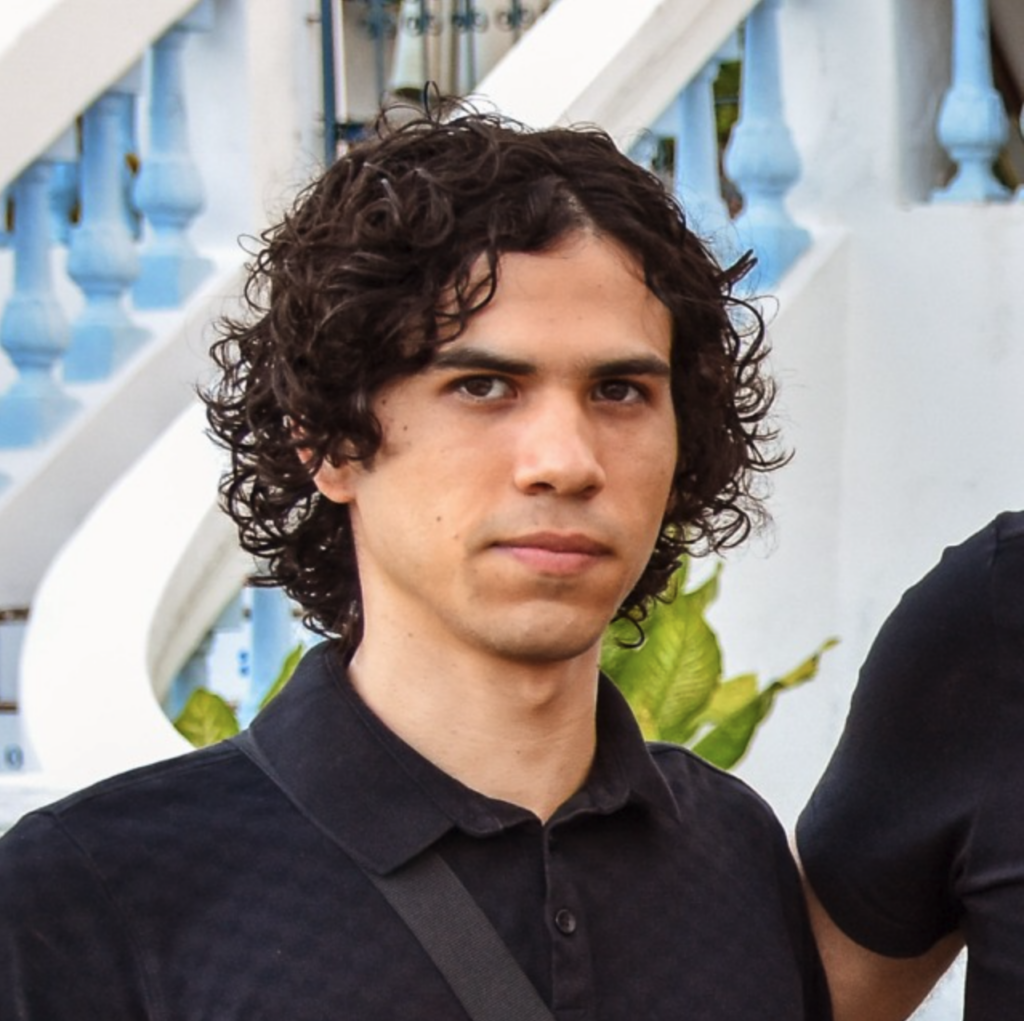
Main persona
Luana Andrade
28 years old · Recife, PE · Home office · Middle income
- Wants to go out on weekends but does not know what is happening.
- Uses Instagram as her main source, but the algorithm does not surface cultural events.
- Has missed events she would have loved due to lack of information at the right moment.
- Decides based on price, distance, and company.
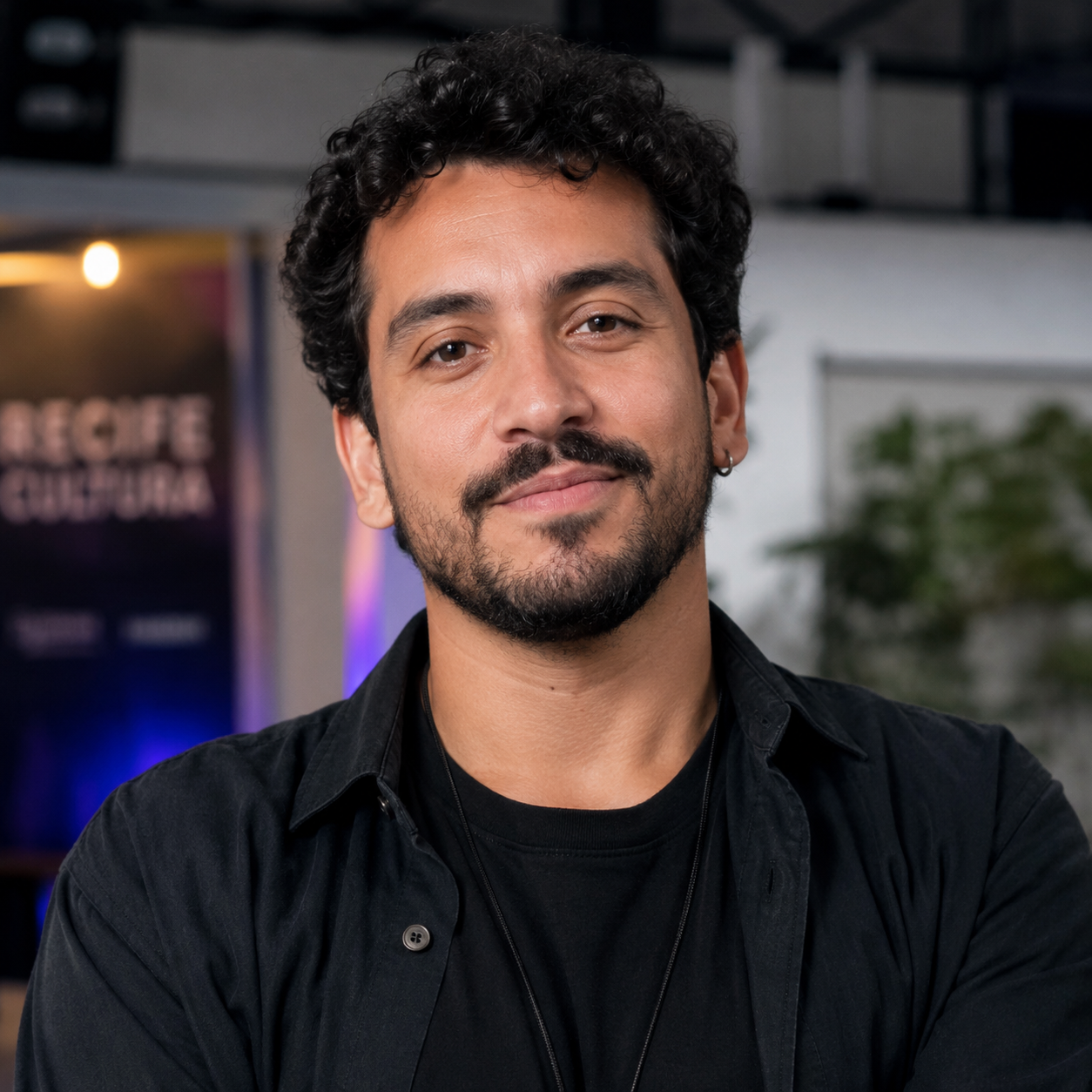
Independent musical producer
André
30 years old · Event producer · Recife Metropolitan Area
- Organizes events in different venues and uses social media to promote them.
- Independent events compete for visibility with large productions.
- Represents the B2B side of the product — reach without a marketing structure.
AS-IS Journey — Luana
Intention
Pain
No clear source to consult
Opportunity
Proactive notifications and personalized suggestions
Informal search
Pain
Ephemeral and scattered information
Opportunity
Hub with centralized calendar
Active exploration
Pain
Only paid or commercial events, too much noise
Opportunity
Useful tags: free, cultural, family-friendly
Decision
Pain
Lack of data on accessibility and reliability
Opportunity
Practical information and social proof
Post-event
Pain
Good experiences are rarely shared
Opportunity
Quick review and native sharing
Concept and brand
Partiu is an invitation to action
“Is there anything
happening today?”
The brand is not institutional — it speaks like a well-informed friend who knows what is happening in the city. *Partiu is a slang, the English equivalent would be "Let's go!"
Explorer
Curiosity, discovery, freedom.
Friend / Everyman
Belonging, accessibility, no elitism.
Spontaneous · Urban · Social · Vibrant · Accessible · Easygoing
Radial gradient
Orange → purple in the headers of the main screens. Identity element, not decoration.
Typography
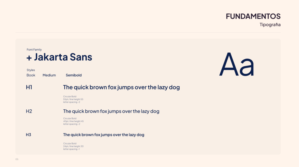
Plus Jakarta Sans — modern, readable, friendly. Regular to Bold.
Icons
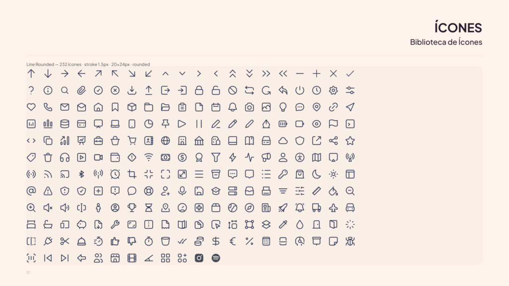
Tabler Icons, Line Rounded style — a single library for full consistency.
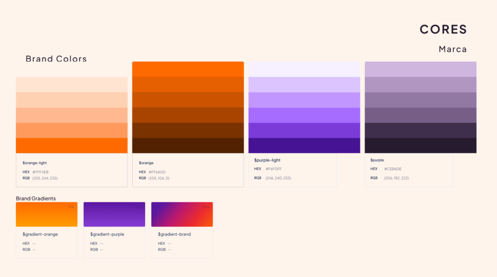
Orange
#FF6A00
Brand color for energy and action. Used to highlight decisions, calls to action, dates, tags, and interaction points.
Light tones
#FFF4EB
Breathing room for light surfaces, soft contrasts, and reading moments with a lighter feel.
Purple
#471395
Expressive layer of the identity. Adds contrast, depth, and personality to headers and visual elements.
Purple neutrals
#271B2F
Structural tones for backgrounds, cards, contrast, and hierarchy. They support the product’s urban and nighttime aesthetic.
Prioritization
What should be built first?
The features were organized in a MoSCoW Matrix based on research data and the mapped journeys.
Must Have
MVP
- Personalized feed based on onboarding interests
- Category, price, distance, and date filters
- Detail page with complete information, including accessibility
- Profile with history and wishlist
- Search with automatic suggestions
Should Have
Important
- Notifications and reminders for saved events
- Indicator for tickets running out
- Reviews and comments
- Social login
Could Have
Future
- Spotify integration
- See friends who are going to the event
- Ticket resale channel
- Combined advanced filters
User flow
Discover and attend an event
The main flow was designed around the “happy path” — the ideal, frictionless journey.
Access
Onboarding
Personalized feed
Search and filters
Event detail
Profile and history
Wireframes
Validating the structure before the visual design
Low-fidelity wireframes (375 × 812 px) validated the information architecture and the flow between screens before any visual decision.
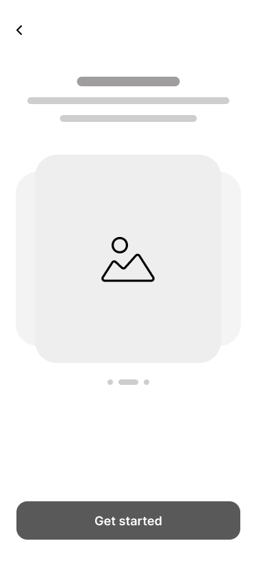
Onboarding
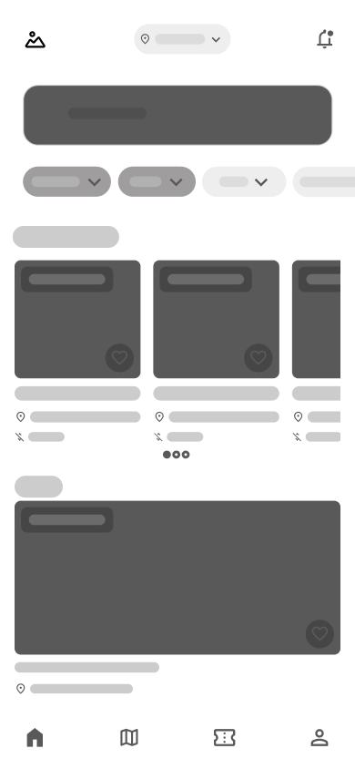
Home / Feed
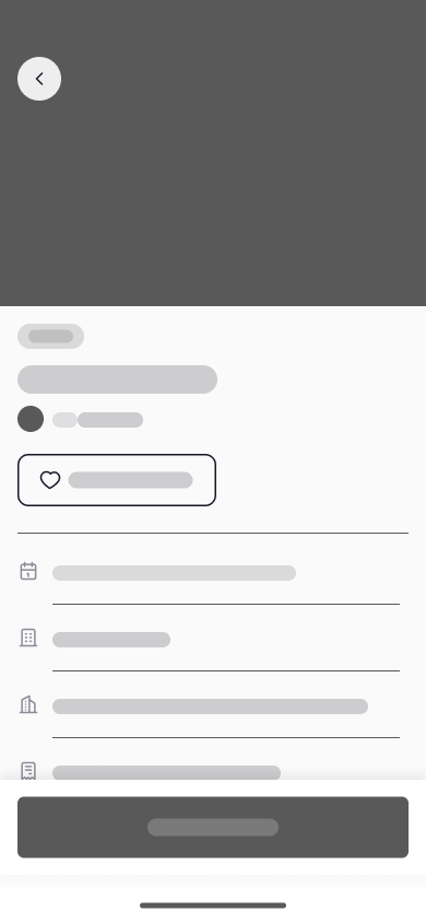
Event detail
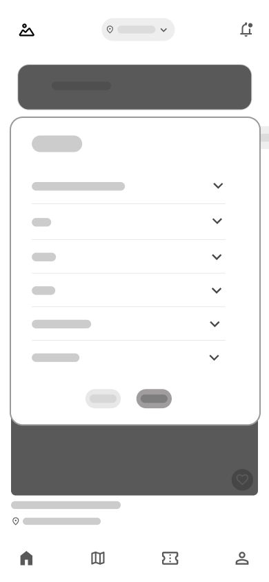
Tickets
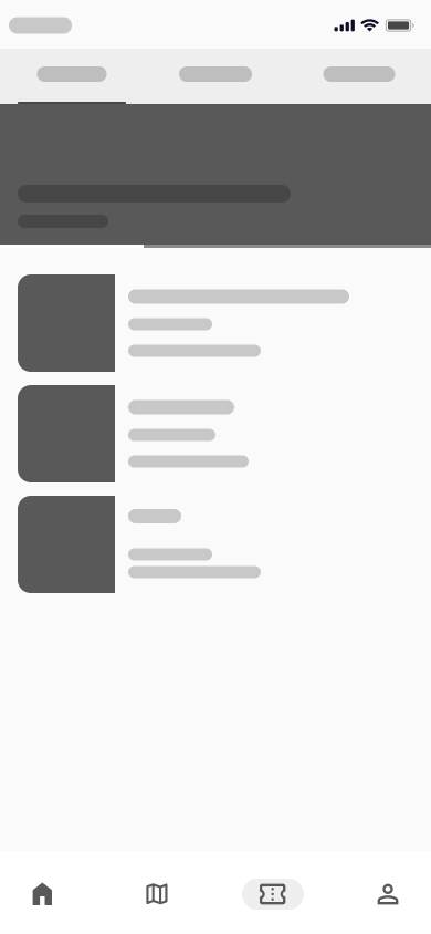
Search and filters
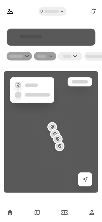
Map
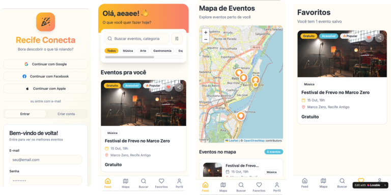
Exploratory prototype / Lovable
Mid-fidelity wireframes
Exploratory prototype created in Lovable to quickly validate the screen structure, the main flow, and the information architecture before visual refinement.
Design system
Building before designing screens
The design system was fully developed before any high-fidelity screen. This decision accelerated production, ensured consistency, and eliminated rework — organized into 13 sections.
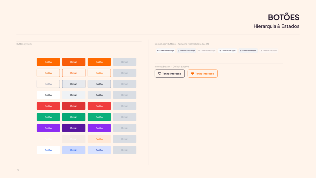
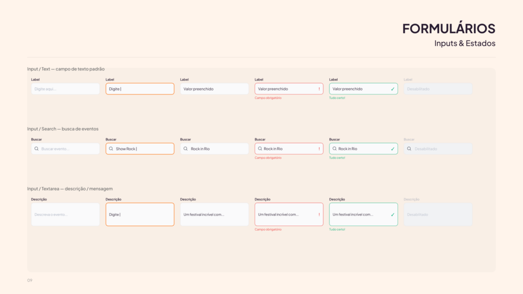
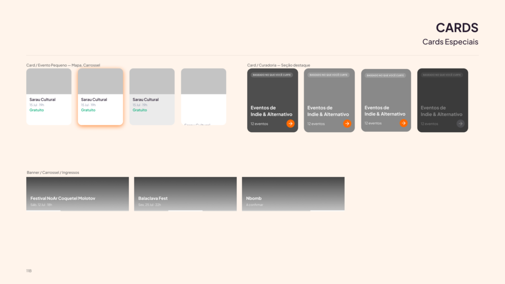
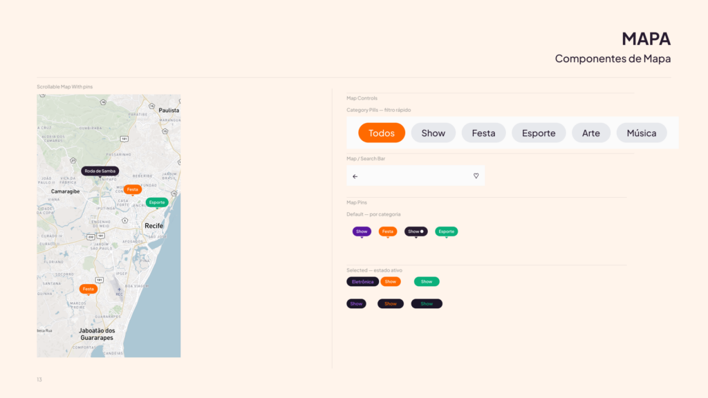
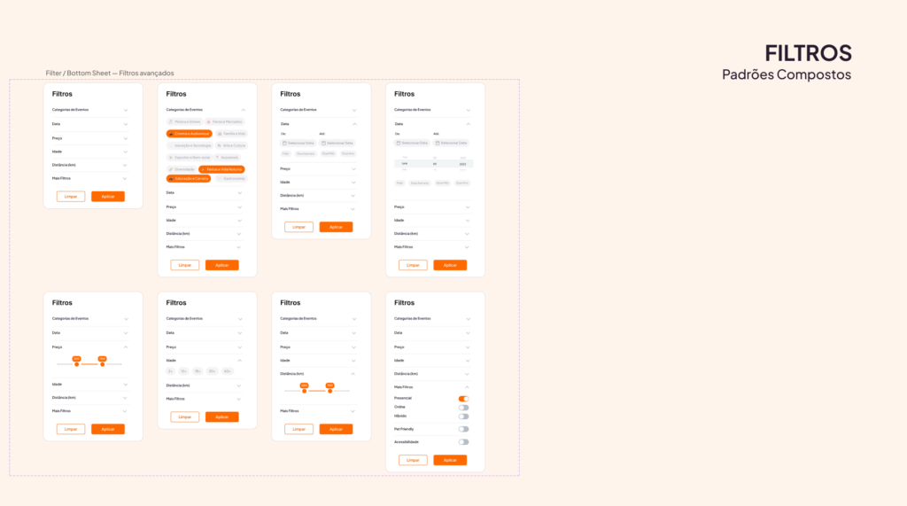
Based on this foundation, the UI Kit was organized into 13 component groups, covering everything from visual foundations to complex navigation patterns, filters, maps, cards, and interface states.
Foundations
Palette, typography, spacing, and mobile grid.
Atoms
Badge/Tag, Avatar, Toggle, Rating, and Chip/Filter.
Forms
Input, Email, Password, Search, Select, and Textarea — 6 states each.
Buttons
9 variants × 4 states; Tabler icon via boolean property.
Cards
Vertical, horizontal, small, curated, trending, nearby, ticket, and saved.
Navigation
Bottom Nav with 4 tabs and Top Bar in Default, Back, Search, and Transparent states.
Map
Map Pin with state × category; default, selected, and cluster.
Compositions
Filter Row, Section Header, Avatar Group, and Organizer Card.
Onboarding
Progress Bar with 5 steps, selection cards, and category cards.
Advanced filters
Bottom Sheet with category, date, price, and location accordions.
Illustrations
4 flat editorial illustrations for onboarding.
Icons
Complete Tabler Line Rounded set.
Images
Biblioteca de imagens de eventos para cards, headers e estados editoriais do produto.
High-fidelity prototype
From research to screen
With the design system established, the screens followed the guidelines: light mode with #FAFAFA background, orange-to-purple radial gradient in the main headers, white cards with soft shadow, Plus Jakarta Sans, and orange used sparingly.
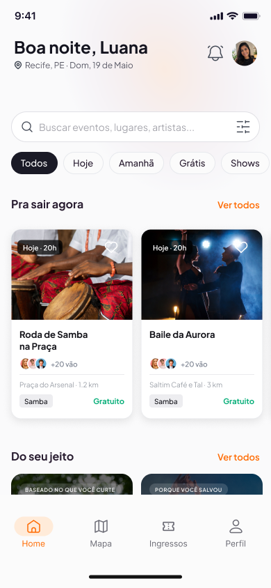
Home
Gradient header, greeting, search, quick filters, and card sections.
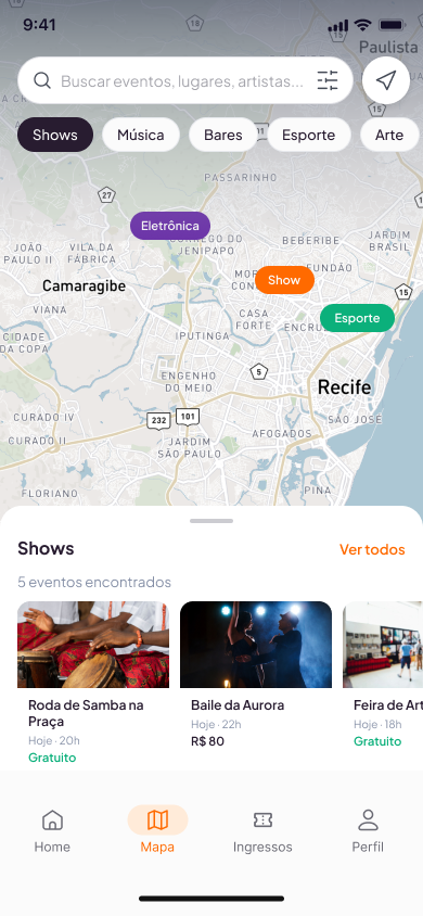
Map
Location view, nearby events, interactive pins, and map navigation.
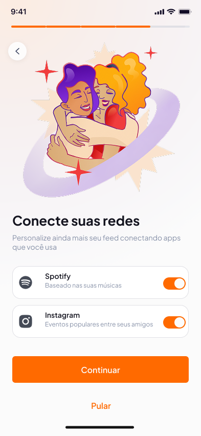
Onboarding
Initial setup, location, interest preferences, and experience personalization.
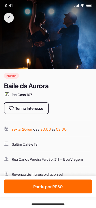
Event detail
Complete information, event vibe, producer, accessibility, social proof, and ticket CTA.
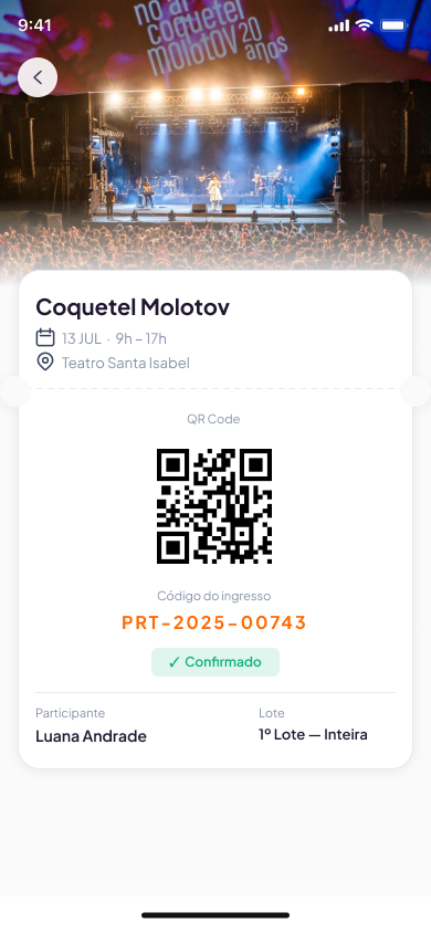
Tickets
Saved ticket, available proof, and organized access inside the app.
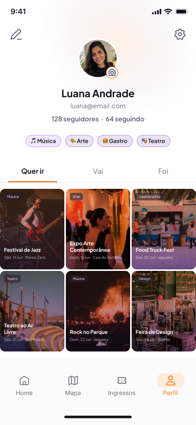
Profile and history
Saved events, tickets, past event history, and user preferences.
Tools and AI
AI-assisted process
Artificial intelligence was integrated into the process with well-defined roles at each stage — always guided by human design decisions.
Gemini Deep Research
Desk research and synthesis of secondary data about the market and user behavior.
Lovable
Mid-fidelity prototyping — a quick screen structure to validate the information architecture.
Claude + Figma MCP
High-fidelity prototyping in Figma — componentization, interactions, and automation via Desktop Bridge.
The tools accelerated execution, but the conceptual, visual, and experience choices were made by the team.
Business model
Viability beyond the interface
A Business Model Canvas contextualized the product as a digital business.
Value proposition
Easy, personalized discovery; centralized by region, price, and category; smart notifications; a solution for independent producers.
Segments
Urban young adults aged 18–40; tourists and new residents; organizers; small businesses and cultural venues.
Channels
iOS/Android app; responsive website; Instagram, TikTok, Facebook; email; local influencers.
Revenue
icket commissions; premium plans for organizers; targeted advertising; sponsorships; featured placements.
Partners
Organizers, concert venues, cultural spaces; ticketing platforms; local creators.
Costs
Development and technology; marketing and acquisition; support; content curation.
Learnings
Key takeaways
The research with 127 respondents anchored decisions in real data — without it, initial hypotheses would have guided the design in the wrong direction.
Building the design system before the screens accelerated production and ensured consistency. The time invested paid dividends with each new screen.
Clarity around archetypes, tone of voice, and palette before designing screens eliminated visual uncertainty during construction.
Human-AI collaboration accelerated the process without compromising quality — as long as the roles were clearly defined.
The illustration system brought emotional cohesion to onboarding and reinforced the brand identity.
Next steps
What comes next
Moderated usability tests with residents of the Recife Metropolitan Area.
Validate onboarding and map-based discovery with real users.
Features for independent producers: promotion and basic analytics.
More sophisticated recommendation mechanisms.
Complete the purchase flow: checkout and confirmation.
Iterate the product based on real feedback from the region.